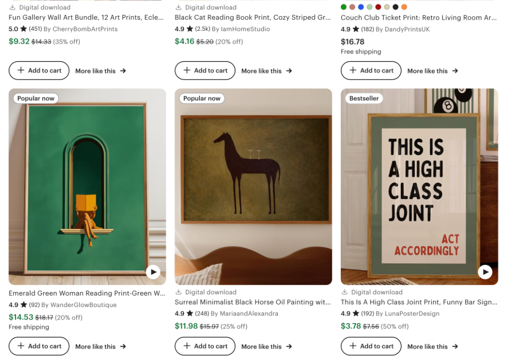
Your first listing image is competing against thumbnails from thousands of other sellers in a tile barely 200 pixels wide. Most art listings lose that competition before anyone clicks, not because the art is bad, but because the photo is.
This is a complete breakdown of how professional Etsy art sellers structure all their listing image slots: what image types to include, in what order, and why the first image is worth more than all the others combined.
Etsy allows up to 20 images per listing. In practice, the first 8–10 are what matter. We'll go slot by slot.
Why listing photos determine everything for art
Etsy's search algorithm surfaces listings with higher click-through rates above those with higher sales alone. A better first image lifts your entire shop's ranking, not just one listing.
Art is entirely a visual purchase. A buyer cannot smell, touch, or feel the weight of a print. The only proxy they have for quality is your photography. The gap between amateur and professional listing photos in the art category is large, and exploitable. Most sellers are still using iPhone photos propped against a white wall.
The three things a great listing image does
- 1.Earns the click. Your thumbnail competes in a grid. It needs to stop the scroll in under a second.
- 2.Reduces imagination burden. Buyers can't visualize a print's scale or how it will look on their wall. Show them.
- 3.Signals quality and price. A professional mockup tells buyers the price is justified before they even read it.
Technical requirements (the quick version)
| File types | JPG, GIF, or PNG |
| Recommended size | 2000 px on the shortest side, 72 PPI |
| Max images | Up to 20 per listing |
| Aspect ratio | Any ratio accepted. |
| First image | Displayed in 4:5 portrait format in search results. Account for this. |
| Video | 3–15 sec, up to 100 MB, most file types, no audio |
Etsy crops your images differently depending on context. In search results and the app, listings are displayed in 4:5 portrait format. On the product detail page (PDP), the main image is shown square (1:1). Any aspect ratio is accepted — but designing your first image in 4:5 portrait gives you the best result across both views.
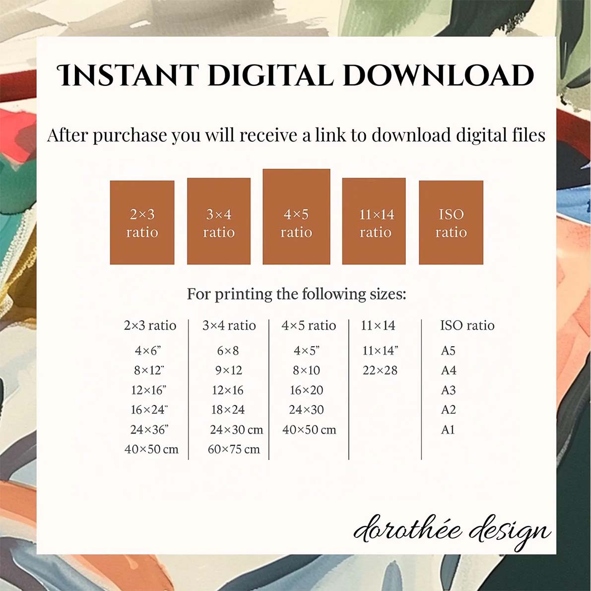
Do I really need to upload 20 images?
Short answer: no. Many of the best-performing art listings on Etsy have 4–6 images. A strong hero shot, a second room scene, a detail or texture shot, and a size reference is often enough to convert a buyer who is already interested.
That said, there are real reasons to fill more positions. Some sellers and SEO researchers report that Etsy's algorithm appears to favor listings with a higher image count — which may be one reason Etsy raised the maximum from 10 to 20. A listing with 10 well-chosen images also gives undecided buyers more to engage with, reducing the chance they leave to compare alternatives.
The honest rule: quality beats quantity. A listing with 5 excellent images will outperform one with 10 mediocre ones. Fill positions that you can fill well. Leave the rest empty rather than padding with weak images.
Choosing the right listing photos and video
Let's go through each of the 10 listing photos (and the video) you'll need to complete your art listing.
The primary listing image
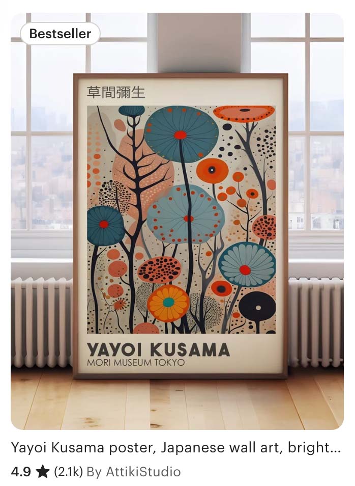
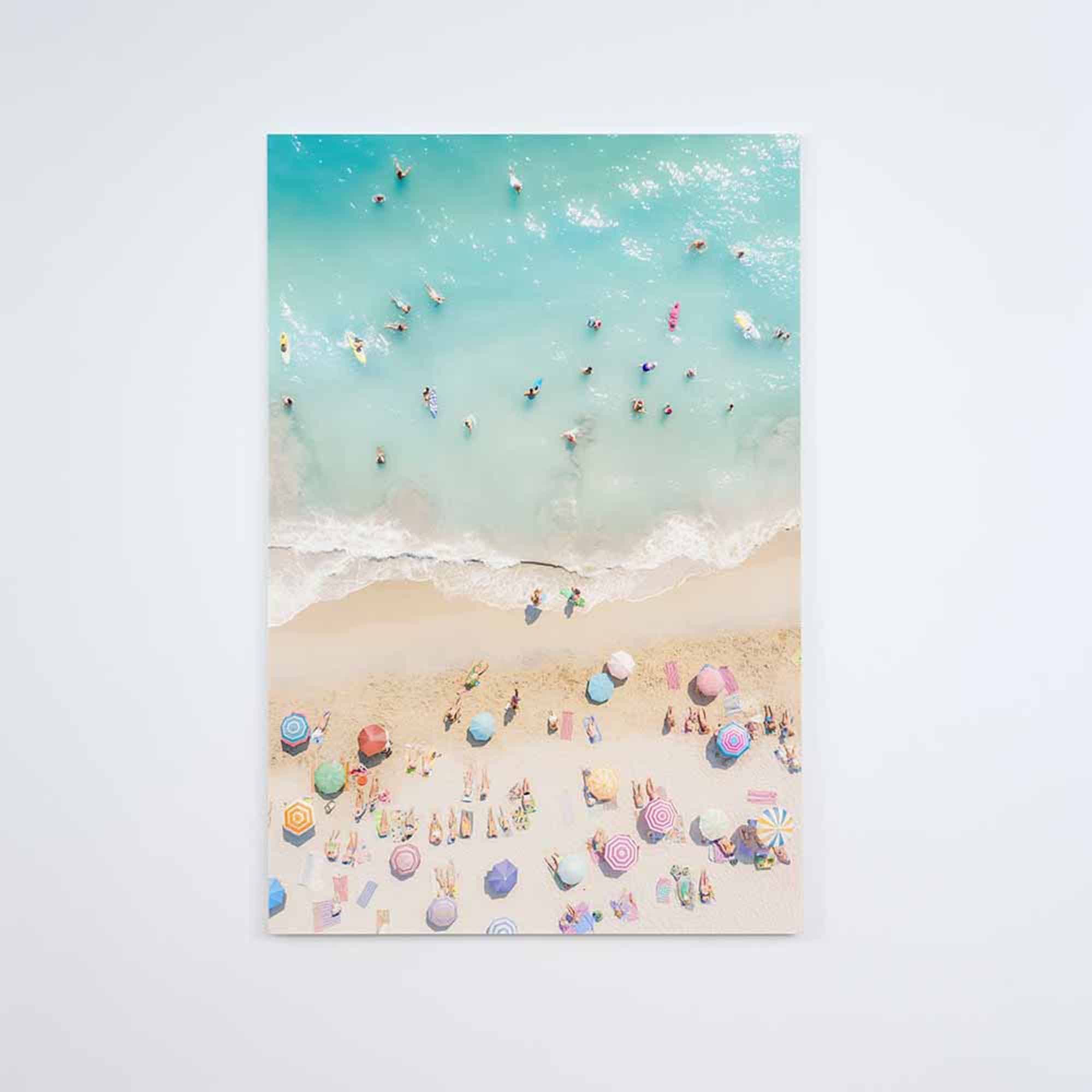
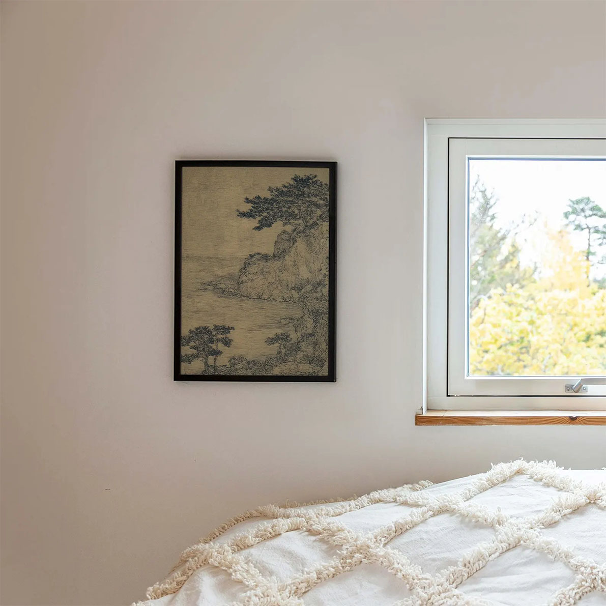
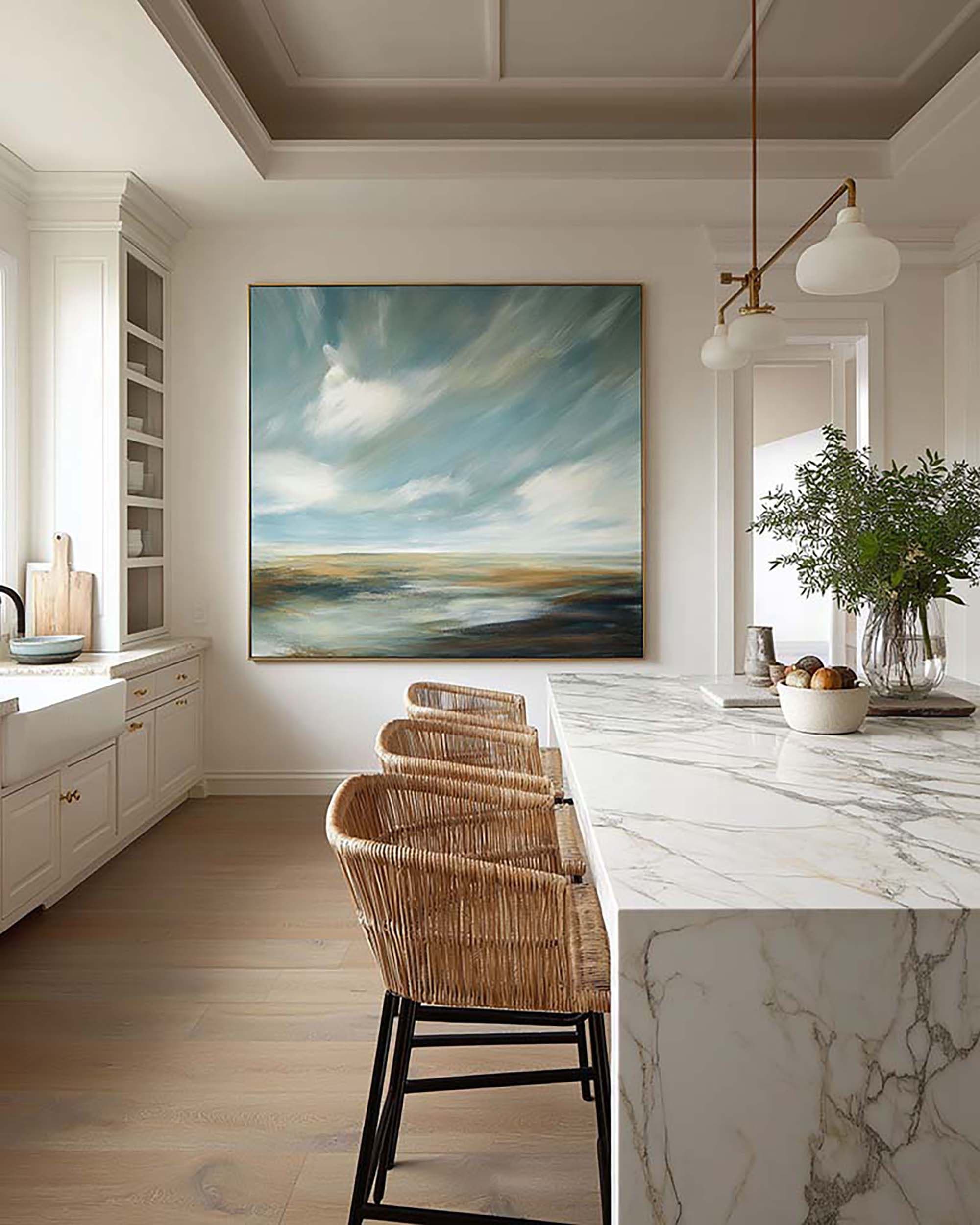
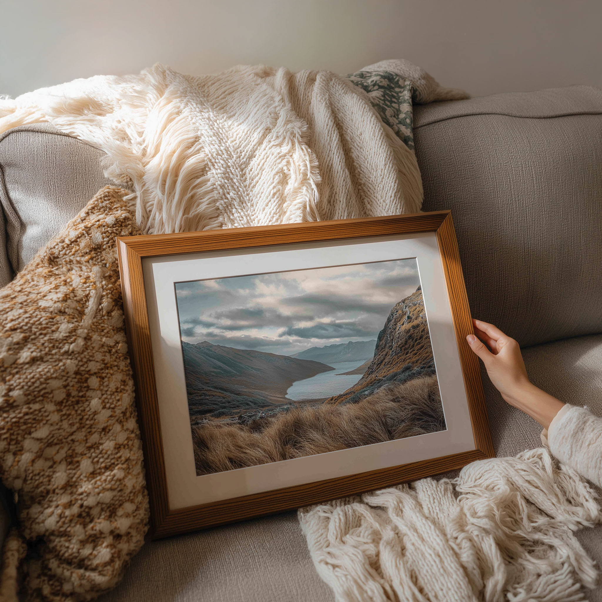
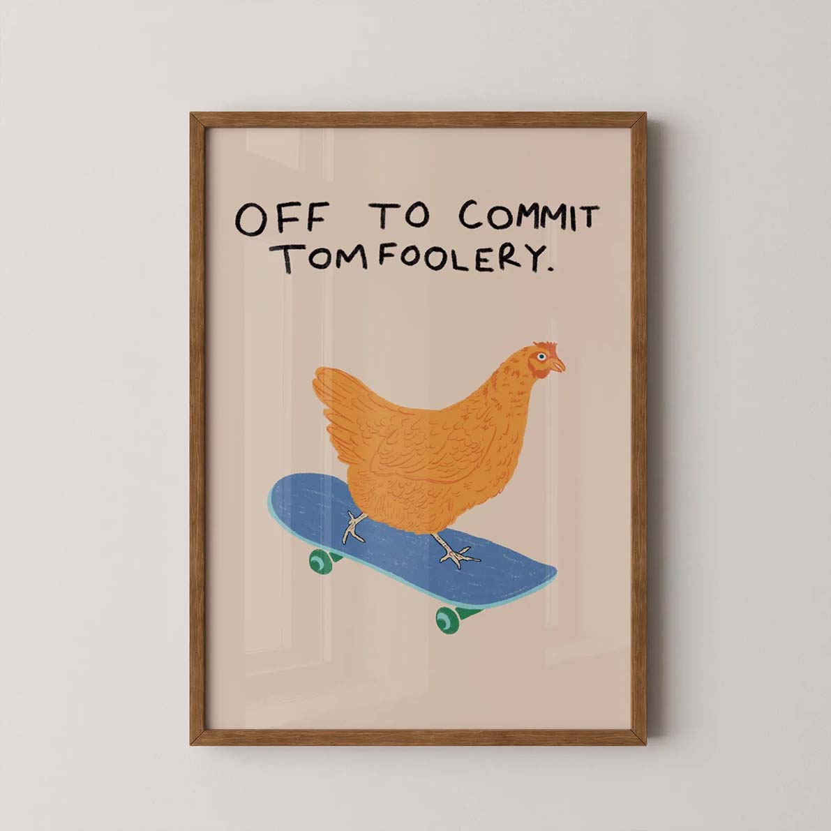
Your first photo is the primary listing image, i.e. the first image displayed on your listing and the image used in search results. This image alone determines 80% of your listing traffic. It should show your art large, close, and clearly visible — no glare, lens flare, direct sunlight, or harsh shadows washing out the image. Not a wide room scene where the print is a small rectangle on a distant wall.
The frame should be on a wall or leaning against one on the floor. The background is secondary. What matters is that the art is immediately readable and dominant in the frame.
One critical detail: your artwork must be fully visible within a 4:5 crop of the photo. Etsy displays listing thumbnails in a 4:5 portrait format in search results. If part of the art is near the edges of a wider or squarer image, it may get cropped out entirely — leaving buyers unable to see what they're actually buying.
How much of the shot should the art fill?
- Portrait or tall art: aim for the artwork to fill roughly 80% of the image. The frame, wall, and floor are supporting cast.
- Square or landscape art: aim for around 50%. Use the negative space around the art deliberately, with a clean wall behind it.
Shop our primary listing mockups
The Video
Etsy allows one video per listing, 3–15 seconds, no audio. A short video showing the artwork from multiple angles, the texture up close, or the framed piece in a real room immediately elevates the listing above every static competitor on the page.
The most effective format for art: a slow animated zoom into the framed piece in a real room, with natural lighting. It reads as cinematic, not promotional. Bello exports animated zoom videos directly from Studio, ready to upload to Etsy.
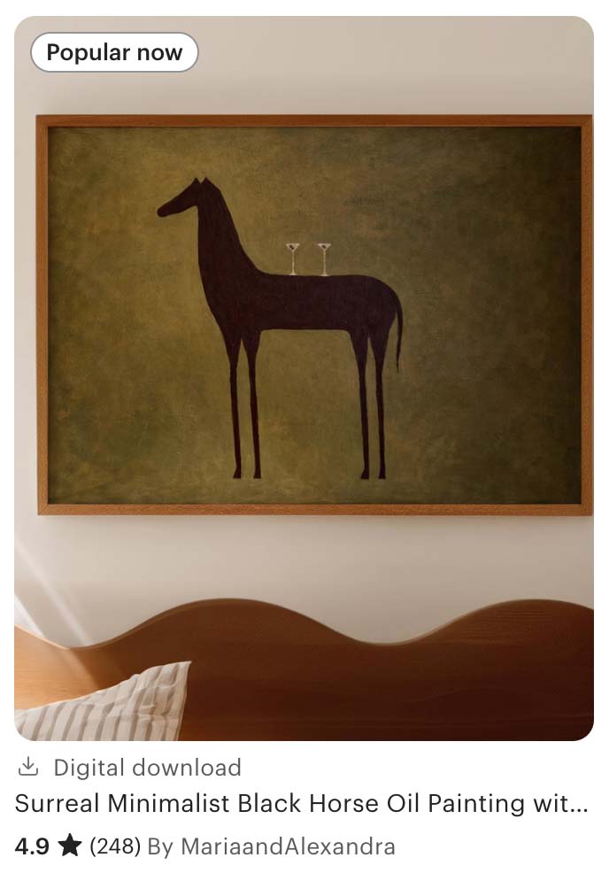
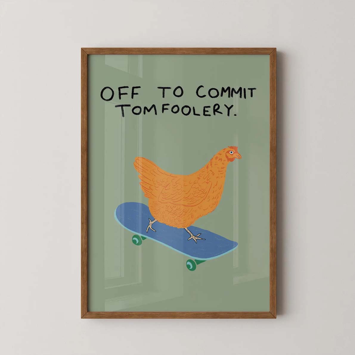
A room or second frame style
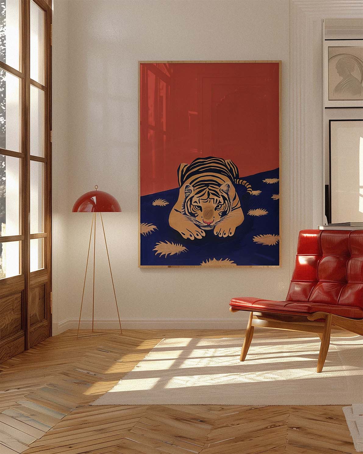
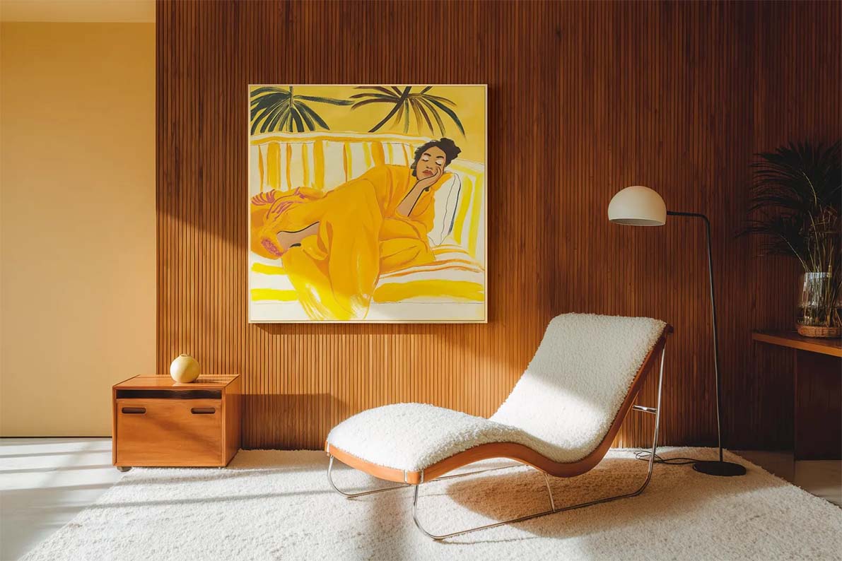
Unlike the primary image, this image can afford to be more creative and atmospheric. The primary image needs to be clean and readable at thumbnail size. Here, you have space to be moodier: an elegant scene with dramatic cast shadows, directional natural light, or a more stylized interior that speaks to your aesthetic. This is where buyers fall in love with the art, not just notice it.


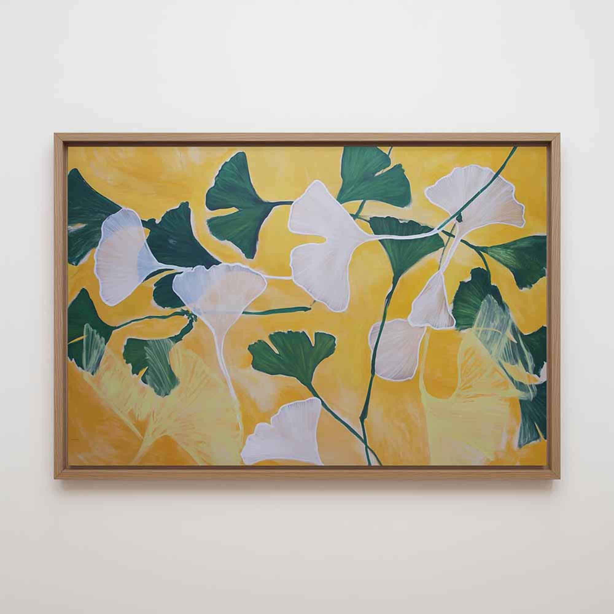
The detail or close-up shot
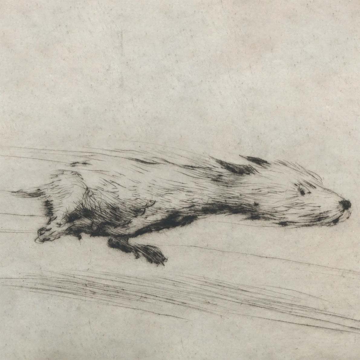
Shows texture, print quality, and paper. Critical for fine art prints and originals. This is the image that justifies a premium price point. Should be a flat-lay or tightly cropped photo of the physical print, not a mockup. For digital downloads: a zoomed-in crop of the digital artwork itself. For canvas: show the wrap depth and texture.
Size reference in context
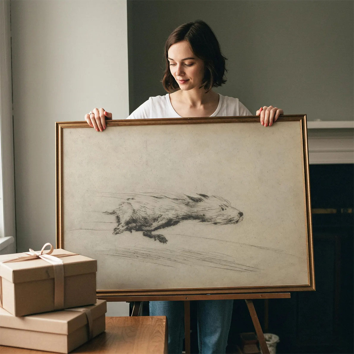
Buyers consistently struggle to visualize scale. "18 × 24 inches" is an abstraction. A room scene with a person standing next to the framed piece (or other elements with recognizable size) makes the size immediately tangible. This single image reduces the most common source of disappointing reviews: "it was smaller than I expected."
Gallery wall or styled context
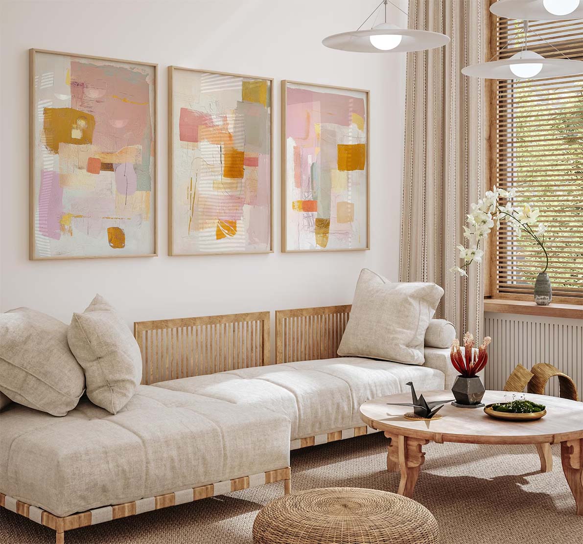
Optional but highly effective for prints priced above $40. Shows the artwork as part of a larger interior vision: multiple frames, styled shelf, layered room. This is the highest aspiration trigger: "I want my home to look like that." Also useful for prints that are commonly bought as part of a set.
Variants, alternate colorways, or sizes
If you offer multiple sizes: show the same room with a note indicating the difference in scale. If you offer color variants: one slot per variant. If you only have a single product at a single size, use these slots for additional room styles or different framing options. Consistency across the image set reads as professional.
What's included / product spec card
A clean flat-lay or typographic image stating clearly: what the buyer receives, paper type, whether a frame is included, and shipping format (rolled vs. flat vs. framed). For digital downloads: explicitly state "Digital Download — No physical product" in large, clear text. Buyers who see this slot before purchasing ask fewer questions and leave fewer misunderstanding reviews.
Artist or process photo
Optional, but powerfully trust-building for higher-priced originals. A photo of you, your studio, or the printing process. If you're not comfortable showing yourself: a photo of the print being packaged, a close-up of your work materials, or a flat-lay of the printed and rolled product works equally well. For originals, showing the physical work-in-progress increases perceived authenticity significantly.
Print specification or care card
Paper weight, finish (matte vs. satin vs. glossy), archival rating, and print technology. For frames: wood type and glass type. For canvas: giclee or standard, depth of the stretcher bar. This slot is a trust and returns-prevention tool. The buyer who reads this before purchasing already understands exactly what they're receiving.
Final step: adjusting thumbnails
Once your images are ready, you can create your Etsy listing. One last important tip is to always adjust your image thumbnails.
Etsy lets you manually adjust the thumbnail crop of each of your listing photos. Always center your artwork in the thumbnail, and do it for all images in your listing, not just the primary one. This will make sure your art is always front and center. This is especially important for the primary listing photo.
Mockup vs. real photography: the honest answer
Real photography wins on authenticity: a physical print in a well-lit real room is undeniable. Mockups win on consistency, cost, and speed; a professional mockup gives you 10 listing images that all match each other without a studio, a printer, or a photographer.
The best listings use both: a mockup for the hero image (slots 1–2), real photography for the detail shot and spec card (slots 3 and 8–9). For digital sellers, mockups are effectively the only option, and the quality of modern mockup tools has made the visual difference irrelevant to buyers.
The practical rule
Use a mockup for your hero image: controlled lighting, perfect composition, professional room setting. Use real close-up photography for the detail shot. Most buyers can't tell the difference between a great mockup and a real photograph at the hero image scale. And even if they could, they wouldn't care.
What makes a wall art mockup actually convert on Etsy
Not all mockups are equal. Here's what separates high-converting images from ones that get scrolled past:
Lighting matters more than the room
Flat, even lighting is unconvincing. The best-converting mockups have directional natural light with a slight shadow beneath the frame, making the artwork look physically present on the wall rather than digitally inserted.
Neutral walls convert more broadly
A white or warm-taupe wall works for more buyers than an olive green or terracotta wall. Save niche room styles for slots 2–5. Your hero image should be the broadest possible appeal.
Room scale is often wrong
Many mockups make art look tiny in an enormous room. Art should feel proportionately sized for the space. Bello's true-to-scale rendering solves this automatically: enter your artwork's physical dimensions and the art is sized correctly in every scene — so a 12x16″ print never looks like a postage stamp above a king-size headboard.
The mat changes the perceived value
A mat, even a slim 1-inch mat, elevates the perceived value of a print significantly. It signals museum-quality presentation. If you offer matted versions, show them in the hero image.
Frame color over room color
A black frame on a warm neutral wall is almost universally appealing and photographs cleanly. White frames work well in bright airy rooms. Natural wood frames suit warmer, earthier palettes. Matching frame color to room tone is more important than matching it to the art itself.
Export and file checklist before uploading
- Export at 2000 px or larger on the longest edge. Etsy's zoom feature rewards resolution. Buyers zoom in on art more than almost any other category.
- JPEG at 85–90% quality. PNG is only necessary if you have transparent elements. JPEG at high quality is smaller and loads faster.
- Don't compress below 500 KB. Etsy's zoom quality degrades noticeably under that threshold.
- Name files descriptively before uploading. 'minimal-living-room-art-print-mockup.jpg' rather than 'IMG_1457.jpg'. Some evidence suggests this helps Etsy's image indexing.
- Check the 4:5 crop before uploading. For your primary listing photo, make sure the artwork isn't so close to the edges of the image that a 4:5 portrait crop would cut it off. After uploading, use Etsy's thumbnail adjustment tool to center the artwork within the crop — it won't do this automatically.
The 7 most common mistakes in Etsy art listing photos
1. Dark rooms that hide the art
The frame and artwork disappear into shadow. The thumbnail looks like a home decor photo, not an art listing. Fix: choose mockups with strong natural light sources.
2. Art too small in the frame
The thumbnail reads as a room photo rather than a print. The buyer sees the room, not the art. Fix: choose mockups where the artwork fills at least 30% of the image.
3. Busy, cluttered backgrounds
Throw pillows, bookshelves, plants, and furniture compete visually with the artwork. Fix: use clean, minimal room settings with clear negative space around the art.
4. Using only one or two image slots
Etsy's own data shows that listings with more images convert higher. Incomplete image sets also read as low-effort. Fill at least 6–8 slots.
5. No size reference anywhere
The single highest-volume complaint in art print reviews is 'smaller than expected.' A single size reference image in slot 4 eliminates most of these. Fix: always include one.
6. Inconsistent lighting across the image set
One warm daylight mockup, one dark moody shot, one overexposed flat-lay. Together they look like a different seller made each one. Fix: choose all room mockups from a consistent source.
Now, go build your listing
You have everything you need: a position-by-position image strategy, the technical specs, and the common mistakes to avoid. Need a head start designing your listing photos? Try our free Etsy listing generator below — just upload your artwork, and let us generate all your Etsy art listing images.